Eco Tooth App
Tools
Sketch | Miro | Google Drive | Zoom |WhatsApp | Facetime | Slack | inVision | Spark
Techniques
Double Diamond | Competitive Analysis | Surveys | User Research | Affinity Map | User Persona | User Flow | ‘How Might We’ Statement | Feature Prioritisation | Design Studios | App Maps | Sketching | Digital Wireframes | Visual Design | Usability Testing | High Digital Mockup | Mood Board | Style Guide
My Role
I co-developed the user interview questions with my colleague while also creating the user persona for our project. I also organised the design studio using Miro to make the whole process smooth for my colleagues and Eco Tooth stakeholders. I also created the low and mid-fidelity designs for the ‘home’ and ‘setting’ page of the app. I was part of a team of 4 who worked remotely for 2.5 weeks.
Meet the Team
Layan Algurashi, Kelechi Ezeonu, Kiesha Mundin, Joe Whitby
Who’s Eco Tooth?
Eco Tooth is an eco-friendly company that designs and manufactures sustainable, stylish and biodegradable toothbrushes. Eco Tooth sells their products directly to customers, which reduces costs and allows them to sell their products at an affordable price.

The Challenge
Eco Tooth stakeholders asked our team to design an iOS mobile application connected to their brand new Tooth+ Smart Brush. This mobile app easily displays and communicates readable data that allows Eco Tooth customers to :
- • See their oral health score
- • Track habits and dental routine
- • How well and long customers brush their teeth
- • AI chat that allows customers to ask questions about dental hygiene issues
The Problem
Users need a way to improve the thoroughness of their dental routine because they want healthy white teeth.
Discover Phase
Direct Competitor Feature Comparison
My team and I started with identifying Eco Tooth’s competitors and identifying their key strengths and weaknesses. This allowed us to see what features worked and what to stay away from, as well as find ways to make Eco Tooth’s app unique and accessible to current and future customers.
We first started with direct competitive analysis and looked at well-known toothbrush companies with apps such as Sonicare Direct App, Colgate E1 and Oral B: Smart Series.

Indirect Competitor Feature Comparison
We also carried out indirect competitor analysis, as we wanted to understand the payment and subscription options and customer incentives to encourage customers to use the app. We looked at apps such as Babylon Health, Calm, Classpass, and Flow.
Our team found that Eco Tooth’s indirect competitors offered a variety of features that includes a monthly subscription method and offering premium options for their customers.
We noticed that providing customer incentives and free product options were the least common trends with our competitors. This can be an opportunity for Eco Tooth to make the app more inviting for customers compared to other competitor apps.

User Interview and Affinity Map
We set a facilitator to talk about the keywords and themes mentioned during the interview. Our facilitator then grouped all of the findings.
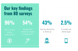
Interview Takeaways:
- • The majority of users would be interested in a sustainable toothbrush.
- • People didn’t know that toiletry subscriptions existed.
- • Users assume that an app that maps your mouth would be too expensive and too complicated for them.

Define Phase
User Persona: Who are we designing for?
I worked with a colleague to develop the user persona, which we based on our findings during the user research. We based our findings on the goals, motivations and behaviours we identified during the research. We developed our persona to help us focus and guide us through the development of the Eco Tooth app.


We believe that by creating a dental mapping app for Jamie, we will improve her dental hygiene. We will know this to be true when her dental score increases and her routine is tracked.
Feature Prioritisation
Due to time constraints, we had to prioritise the key features that would be ideal to have on the app. This was organised based on how essential the features were, and the corresponding level of effort they would take to develop.
Due to this, we focused on the top portion of the feature prioritisation map.

Design Studio
We collaborated with our stakeholders remotely by conducting the design studio. This allowed us to ideate and brainstorm some features and combine them as we went through the design studio. This also let our stakeholders get a sense of how the UX process works.
Design studios usually take place in person, but due to COVID-19, we had to change the setting of our design studio to Miro and Zoom. I organised the board by having different sections based on the HMW and adding different coloured dots for each participant for the dot voting.

Develop Phase
Initial Sketches
Low Fidelity Prototypes: 11 User Tests
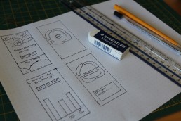
We started by separately sketching ideas and using the design studio as an inspiration to draw our initial sketches. We gathered as a team and combined our initial sketches and took it to low fidelity prototype.
Once we agreed on the layout of the app, we moved our sketches to a digital low fidelity wireframe using Google Presentations in order for my team and me to work collaboratively in real-time.

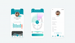
Home Page
8 out of 11 people instantly recognised the centre button as the brushing button even though visuals were not applied to the screen. All of our testers thought that the “score” portion was unclear, which my team and I clarified during the onboarding process.
Brushing Screen
Majority of the users liked the quadrants for the brushing session page. Others have pointed out that realistically, no one would move to brush their bottom jaw without finishing their top jaw first. Lastly, 7 out of 11people liked the personalised tips.
Brushing Summary
People who are invested in their dental health wanted to see a visual representation of the missed parts when they brushed their teeth.
Brushing Stats
Users found the “add data” helpful, as this allows them to track their brushing in case their phone dies or they are using a different toothbrush that day.
The tooth bot icon in the navigation bar was a bit confusing to users as they were unsure of the purpose of the button.
Mid Fidelity Prototypes: 17 User Tests
I worked on designing the mid-fidelity and high fidelity wireframes of the home page using Sketch and took inspirations from the design studio. We used InVision to test it on 17 users.

Users commented that the logo looked like a button, which we changed on the high fidelity. I included clouds on the design to indicate the difference between morning and nighttime. Users found it misleading and confusing as they compared it to a weather app.
No one understood what the “80” was about, which was explained during the onboarding process while adding the “pts” in the high fidelity. It was also difficult for the users to read the stats without the numbers included on the home page.
During user testing, people did not understand how to go back to the Home Page, so we included the navigation bar on the brushing summary page for easy access. Users also found the colour “red” to be off-putting, so we changed the highlights colour to “purple.” Users also wanted an option to brush again over their missed areas.
The icons on the brushing stats page were misleading, as it reminded the users of the weather, instead of the time of the day. They also would want to have the day and date to indicate which data they are looking at.
Lastly. users did not understand the purpose of the tooth bot until they clicked on the button.
UI Design Progression
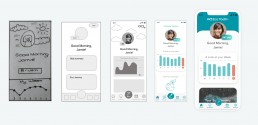
Visual Design
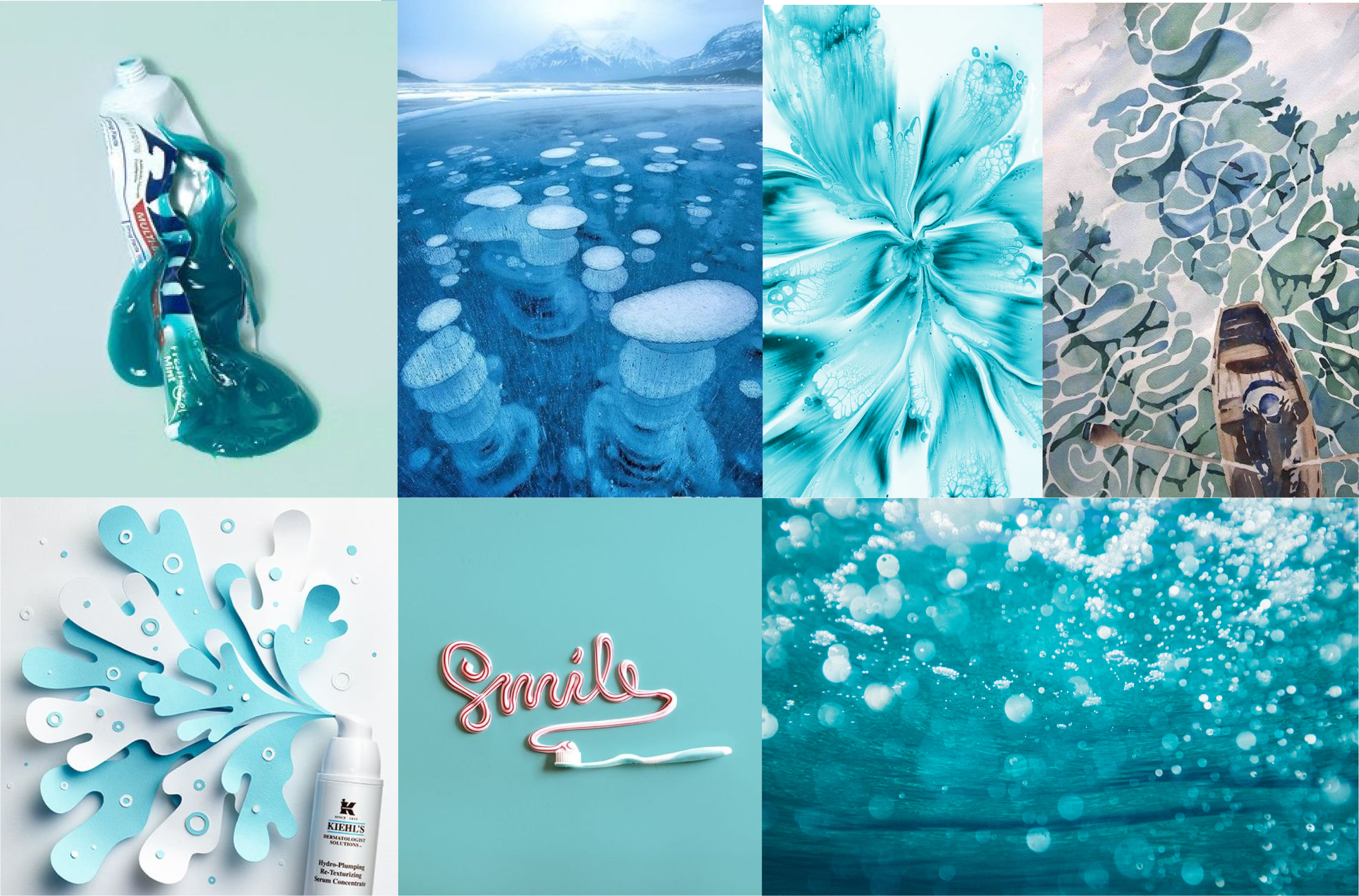
Colour Mood Board and Style Guide
We developed the colour mood board, which gave us the inspiration for the colour schemes that we used on the app. Some of these pictures were taken from their social media and we kept the idea of “clean” “sustainable” and “eco-friendly” in mind as we looked for inspiration.
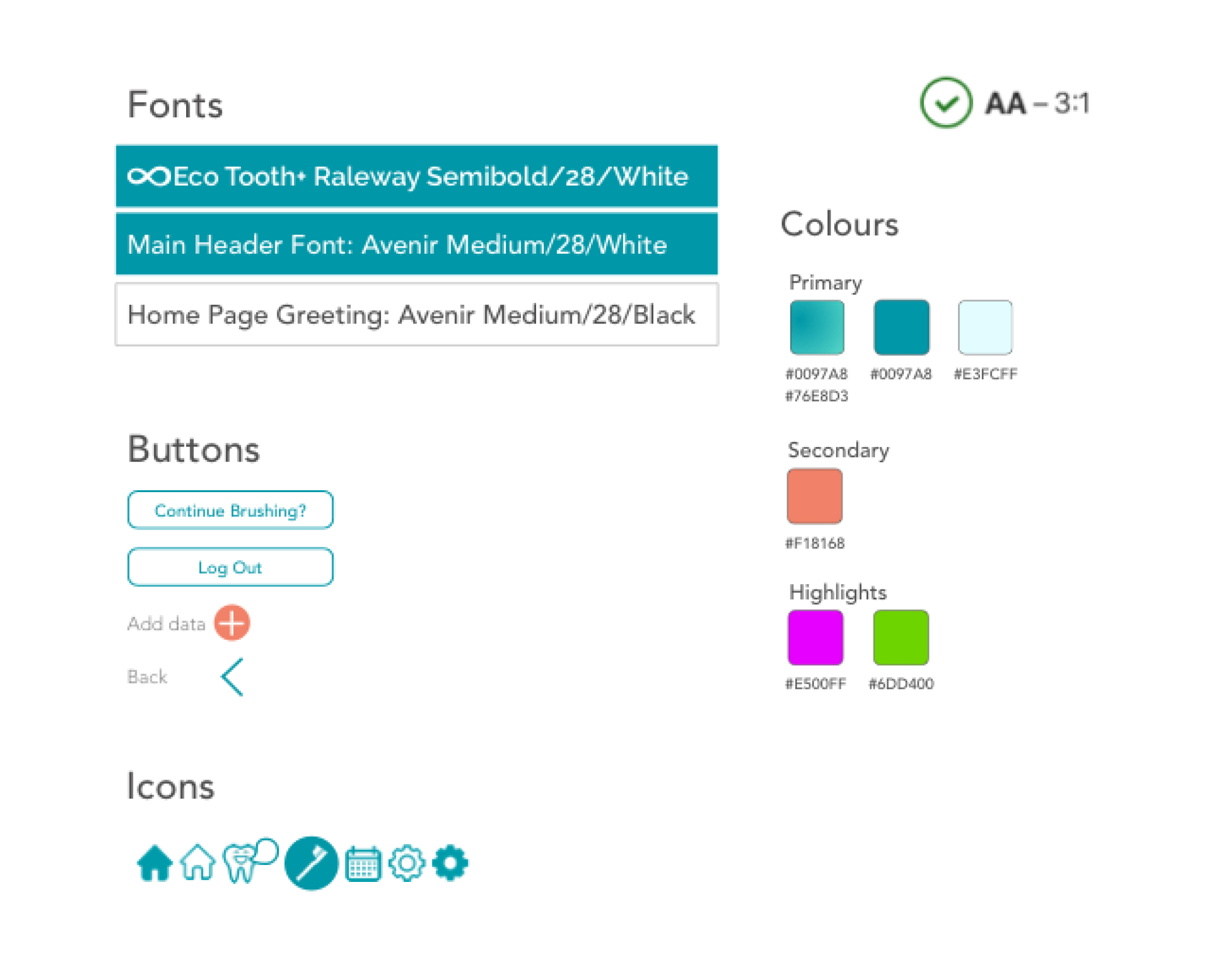
We also made some slight changes with their style guide and altered some of the colours used for accessibility. We used a plugin tool called Spark, which allowed us to see whether it was accessible for people with colourblindness or poor eyesight. We used the fonts that Eco Tooth uses on their websites.
Deliver Phase
Final Design
Feedback from Eco Tooth
After presenting our process and prototype remotely, our clients expressed their gratitude and excitement, especially how we produced a great deal of work in only two weeks. They were satisfied and content with how we managed to meet the brief’s criteria while presenting a product with users in mind.
“You guys have really smashed this out the park” — Joshua Oates CEO
“I’m blown away with how much you’ve done in such a small amount of time” Joshua Oates CEO
Last Minute Thoughts?
Working remotely for the first time was difficult yet a rewarding experience. With the current pandemic, we have to react quickly and find ways to ensure that we effectively communicate remotely. We used different platforms such as WhatsApp, FaceTime, Slack and Google Slides to ensure that my team and I can work together online.
We also had to consider and prioritise our client’s brief requirements while focusing on the essential features required for the app. Design studio became an essential part of our process as this allowed our clients to brainstorm and give suggestions on how to improve our design.
If I were to redo this project, I would focus on recreating the style guide and ensuring that it passes the accessibility requirements. I also want to implement the optional features that our clients mentioned during design studio such as gamification, subscription, and children version of the app.